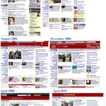
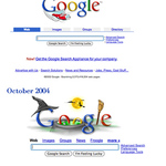
Using the Wayback Machine (http://wayback.archive.org), an archive of past websites and designs, I have put together an evolution of popular websites: Yahoo!, Google, and BBC News. I will be introducing the first instalment of the topic with the evolution of the Yahoo! website.
Evolution of Yahoo!
In late 1996, Yahoo!'s website consisted of a search field with links to categories and sub-categories where users could narrow down their search, similar to searching at a library. By 1997, the website's design became centred, and the categories became more defined and designed aesthetically (in tables). Over the next months, no major changes were made to the design; the focus seemed to be on enhancing the categories and sub-categories and terminology.
In 1999, a major redesign of the website took place. While the top of the website with the search field remained fairly consistent (though with more links and slight image changes around the logo), the width of the website was increased, and a new column was added. The first two columns displayed the categories, now in larger font sizes and Arial type (as opposed to Times New Roman in the earlier designs), with only a few sub-categories described below in smaller Times New Roman font. The third column advertised news and Yahoo!'s features.
By 2000, Yahoo! had introduced an advertisement box underneath its textfield for users to find items and to shop online, defined in a green table; the green colour was enhanced in its horizontal rulers. Throughout this year and the following year, Yahoo! makes minor design changes by using simple borders and removing the shading in the third column and adding two new icons on either side of the logo to advertise new services (the horizontal ruler through the middle of the logo has also disappeared). In 2002, Yahoo! made some minor changes to the design. This mainly consisted of using graphical elements on the website (for the first time, apart from the header), particularly advertisements within the advertisement box that was introduced in 2000.
By the middle of 2002, a major redesign took place; the list of links underneath the search field disappeared and were replaced with styled categories. The logo (and icons around it) was anti-aliased (and not pixelated as it had been before) as Internet speeds became quicker to cope with slightly larger image files. The two-column layout started directly underneath the search field with a banner placement and colourful slanted-corner tabs (using images). The categories became less prominent and moved further down the page.
By late 2004, a major redesign took place. The search field was placed in front of a light blue background, and popular websites and Yahoo! pages were placed in a similar box underneath. The two-column design remained with the news on the right-hand side, but the slanted tabs were removed in favour of simple HTML table mark-up. The advertisement box remained similar with other news features underneath and the removal of the categories. The icons near the logo were redesigned with the removal of the circles around them. No major design changes took place until the end of 2006.
Unfortunately, the archives are missing as only a holding page remains between then and early 2010, informing the user to upgrade their browser to see the latest designs. However, in 2010, the Yahoo! website was redesigned with three columns; the first showcasing the partner links, and the second and third dedicated to news and advertising. The heading became simplified with a prominent search field with different categories of search (probably inspired by Google), and the branding changed; the logo became purple instead of red.
The website has not changed much since the latest redesign (2010), but it is possible that a new design will be released later this year. (It seems that Yahoo! tend to redesign their website toward the end of the year.)


Leave a comment